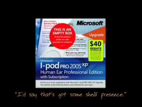
A 2006 parody made by a Microsoft team that shows how the company would redesign iPod packaging, with a box piled with feature claims, logos and clutter in contrast to Apple's clean design.
Why Hacker News points people here: HN commenters bring it up whenever Microsoft product naming, branding or marketing is confusing, pointing to it as a long-running self-aware critique.
“brutal but hilarious commentary on Microsoft's inherent dysfunction when it comes to product naming and packaging”HN comment, 2026
This is supposedly an MS-produced parody of it's marketing efforts. It's very old now (I think it uses a 1st gen iPod?) but is still worth a laugh: this video Thankfully MS have learnt a lot of lessons since.
RecommendsalisonkiskMay 2021
“The original "Microsoft iPod" video from 2006 is much better”
Original 2006 Microsoft iPod packaging video, better than the concept video.
Full comment
It's just a few lines of text complain about Windows, and some windows UI screenshots copied onto a max desktop. Not worth 2 minutes of video. The original "Microsoft iPod" video from 2006 is much better this video
RecommendsgumbySep 2022
“This great (short and funny) internal video from Microsoft was supposed to be a wake up call”
Short funny internal Microsoft video on feature-list marketing.
Full comment
Many tech products are still sold on feature lists. Few people care any more. This great (short and funny) internal video from Microsoft was supposed to be a wake up call, but nothing really changed: this video The fact that Apple doesn't really play that game seems to drive some people wild.
RecommendsjnainaFeb 2026
“brutal but hilarious commentary on Microsoft's inherent dysfunction when it comes to product naming and packaging”
Brutal, hilarious take on Microsoft's product naming and packaging dysfunction.
Full comment
It's over 19 years old, but this video is a brutal but hilarious commentary on Microsoft's inherent dysfunction when it comes to product naming and packaging. Still on point decades later. this video
Cites itsnowwrestlerJul 2012
“This line was part of a classic critique of Microsoft's packaging design.”
> They could show the product in use. This line was part of a classic critique of Microsoft's packaging design. this video
Cites itmturmonFeb 2014
“which was made by a MS team as an illustration of their frustration”
Packaging parody made by an MS team out of frustration.
Full comment
One example of this effect is the packaging parody this video which was made by a MS team as an illustration of their frustration.
Cites italexwassermanOct 2022
Illustrates cluttered PC branding versus Apple's clean experience.
Full comment
That Apple could do it doesn’t mean they will, and the article doesn’t present much actual evidence it will. In Apple long-running saga with Ads it’s always seemed like Apple hates ads because it’s other companies content (and so priorities, aesthetic, and feel) jammed inside an Apple product. And Apple hates anything that ruins the Apple Experience :tm: Paying to be the first App Store entry is great, because it’s Apple showing off the normal Apple content (an app card) within a search list of app cards. But in an app that cuts to some cheap, ugly, non-Apple aesthetic ad - that’s pretty unappealing and ruins the Apple Experience. It’s tougher to craft that Apple type experience while also selling out. I think they’re also aware of the implicit value to their business of being the non-Ad driven eco-system. It’s all part of being premium. Selling to the users who also pay for Netflix premium, Hulu ad-free, etc. It’s built into their business model. In some ways it’s been like that for years - PC laptops come coated in ads from the Intel Inside stickers and pre-installed crapwear, to the design and logos on the product boxes themselves. I’m reminded of this: this video I think Apple sorta, maybe wants Ads because it’s so lucrative, but also recognizes those challenges are real, and tough, and destroy their brand quickly.
Cites itJack000Apr 2023
“This video is a bit old now but it's as true now as it's ever been”
Illustrates how hard restrained, minimalist design is to execute.
Full comment
Actually I don't think most programmers are capable of designing something like spacex.com - every image on the site fits the minimalist theme (and there are hundreds). The photos are always dark in the appropriate areas so the text is readable, and they're dynamically cropped/resized with good positioning for all breakpoints. - the front page appears to be simple, but if you click through the site there are actually a ton of dynamic illustrations and charts like this: link The key thing is that the aesthetic is executed consistently and with restraint. This video is a bit old now but it's as true now as it's ever been: this video Minimalism is the most difficult aesthetic to pull off, because it's easy for the end result to look unfinished, cheap or lazy. I think the problem is not that coders can't be designers, but that coders generally don't really care about design, and I say that as a coder. If you gave the spacex project to the average coder, you'll probably end up with something like sap.com or fortinet.com Web design has converged a lot in the last 20 years because people don't want to learn a new UI for every website they visit. This makes good web design harder , because now if you want to create something memorable and distinctive, you'll need to do it in spite of the navigation and functional parts looking identical to every other site.
Cites itflirJun 2023
“that video was made within Microsoft”
Decades-old internal Microsoft video on its marketing dysfunction.
Full comment
You remind me of this this video which is a couple of decades old now. Funny thing is, that video was made within Microsoft. It's fascinating that everyone can be aware of the problem, but they still can't steer the behemoth.
Cites ittornadronMay 2024
“had to dig it up and still kinda relevant”
Old Microsoft iPod video that is still relevant.
Full comment
reading all of these comments, reminded me of the old "Microsoft iPod" video, had to dig it up and still kinda relevant---it's 18 years old (!!!) this video
Cites itryandrakeAug 2024
“It was funny because all of Microsoft's brand looked exactly like that back in those days”
Parody of Microsoft's botched product marketing.
Full comment
Reminds me of the "Microsoft Re-Designs the iPod Packaging" video[1] from nearly 2 decades ago (wow, I feel old). It was funny because all of Microsoft's brand looked exactly like that back in those days, and you could really picture them screwing the product marketing up that badly. 1: this video
Cites itSvipApr 2025
“Even 20 years ago, Microsoft knew they had problem with its naming and marketing[0]”
Shows Microsoft knew about its naming and marketing problems long ago.
Full comment
Even 20 years ago, Microsoft knew they had problem with its naming and marketing[0], but I guess it didn't matter. [0] this video
Cites itthomasjudgeApr 2026
“this is a critique - from microsofties I think - of MSFT product branding”
Parody critique of Microsoft product branding.
Full comment
Related: (parody): if you haven't seen it, this is a critique - from microsofties I think - of MSFT product branding this video
Cites itjerfJul 2026
“that video came from Microsoft itself”
Classic Microsoft-made packaging parody.
Full comment
Oof, you're reminding me of Microsoft Redesigns the iPod Packaging video: this video For those lucky 10,000 just learning about that today, for extra frisson , enjoy the fact that that video came from Microsoft itself : link
Cites itthomassmith65Aug 2026
“This reminded me of a 20 year old 'viral' video”
Viral 20-year-old Microsoft packaging parody.
Full comment
This reminded me of a 20 year old 'viral' video "Microsoft Designs the iPod Package" : this video
CriticaljustinsbAug 2011
“once every faction at Microsoft has had their say, you end up with this”
Full comment
I've seen some of the previews. I don't put too much stock in them - Longhorn looked pretty awesome as well, until it shipped as Vista. My concern is that once every faction at Microsoft has had their say, you end up with this: this video
CriticalInclinedPlaneJul 2012
“Microsoft is exceptionally bad at this, even if other companies are pretty bad about it too.”
Full comment
Yes. However, all I have to say to this is "The New iPad". Edit: Wait, I had something else to say: this video (Microsoft is exceptionally bad at this, even if other companies are pretty bad about it too.)
Jokei336_Mar 2017Full comment
> Trustonic TEE OS I have visions of the Windows 95 3D screensaver, with the walls, floor and ceiling displaying the many, many NDAs you need to sign to get access to this. (I must admit that what initially came to mind was ~2:25 in this video (2:55).) In all seriousness, this may be the tricky bit. AMD may need to release the PSP spec and get Libreboot to take it from there. Considering the huge amount of support for this though, I can totally see a crowdfunded firmware implementation for the PSP working out.
JokeadolphApr 2024Full comment
> so threw some shit on top and called it a cherry Do you mean metaphorical feces or do you mean "shit" in the general sense of a collection of unspecified materials? I think the canonical example of deciding chocolate wasn't good enough and throwing shit on top was what happened to the LP400 [0] or "Microsoft Re-Designs the iPod Packaging" [1]. 0. link 1. this video
JokekallebooJan 2025
“was reminded of this classic”
Full comment
As far as I can recall, this has been their branding strategy: 1996: Rename everything to "MSN" including a news TV channel 2000: Rename everything ".NET" even if it's not a programming language 2005: Rename everything that remotely touches the internet to "Live" 2013: Rename everything to "365" 2025: Rename everything to "Copilot" even things that are not just an LLM Also sprinkle "Windows" liberally over everything in the late 90's-00's Did I miss anything? Edit: was reminded of this classic this video